Another update and request for feedback, this time for improvements to editing forms! This is a part of our Q3 OpenTEAM ACTION funding, more details here . Hopefully these features can make creating and editing Assets + Logs a much more pleasant experience. There are two main changes:
Sidebar
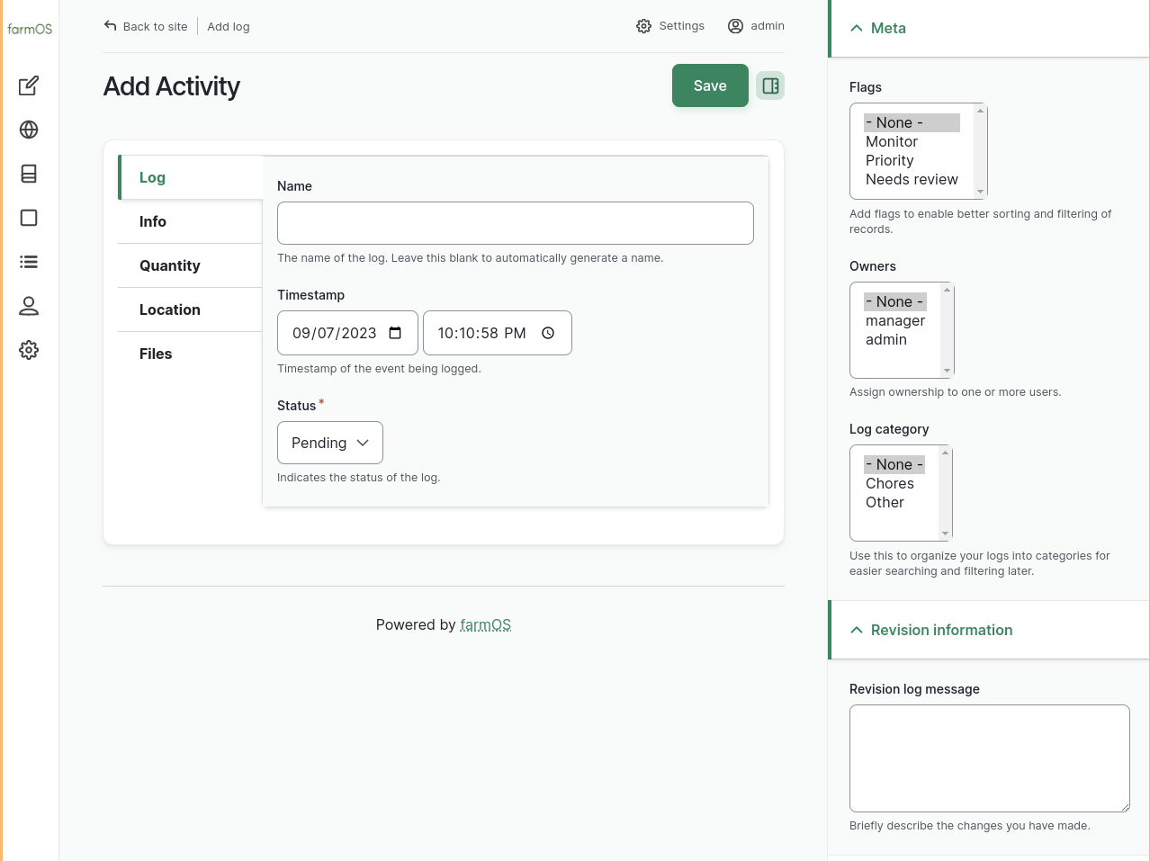
First, this implements Gin theme’s “Content Form Sidebar”. Gin has provided this sidebar for editing Drupal nodes and recently made it available for other entity types. This does a few things:
The sidebar is a good place to put “metadata” fields.
It also moves the “Save” button to the top of the page which means no more scrolling to the bottom to save!
Sidebar groups can be collapsed as well as the entire sidebar hidden
Last, this is a good place for us to provide additional revision/authoring information that we do not currently show on the edit form: author, changed and created timestamps.
Second, we can add vertical tabs to group fields in the edit form to:
Group similar fields, easier navigation to fields of interest
Decrease overall height of the form, less scrolling
Right now I have hard-coded the set of tabs you see in these screenshots. Modules cannot provide additional tabs, although that could be a followup if there is a need. But modules can define which tab fields should go in. Tabs can be in the “main” region or the “sidebar”. Here is an overview of the tabs as I thought of them:
Main tabs
“Entity” (Displays as Asset/Log)**: Provides important & required fields: name, status, timestamp, bundle type (animal type, land type, etc). Only in the “main” region when creating new assets/logs so that the required fields are easily accessible.
“Bundle” (Displays as the bundle, Animal, Harvest): Provides bundle-specific fields. The animal sex or birthdate, or a harvest lot number or source information.
Info: Provides generic base fields that all assets/logs have. Notes, ID Tags, asset parents, log assets, etc. This is the default tab where fields are located.
Location: Provides fields related to geometry or location. Geometry (map), asset location/fixed boolean, and log location reference.
Files: Provides the file and image upload fields.
Sidebar tabs
“Entity” (same as above)**: This tab moves to the sidebar when editing an existing asset/log. Thought being that we can save some space, these fields are changed less often.
Meta: Provides fields for categorizing, flagging, or assigning ownership.
Revision info: Provides the revision log message text box with additional authoring info (author, changed, created timestamp)
Think I like it. Isn’t this a bit like the old farmOS?
It gives a better overview, and makes more sense when adding simple stuff.
I’m a bit worried about mouse movement if you need to visit many tabs, but maybe that’s no problem.
Possible to implement hotkeys or mouse scrolling in a specific area to change sidebar tabs?
Or perhaps hitting TAB on the last field could bring up the next tab?
Good questions. Yes I think the farmOS v1 grouped fields in a similar way but I don’t remember this well… certainly worth considering those design choices!
The additional click/mouse movement is a worry for me as well. On a big screen this almost feels too condensed. But it still quite usable on desktop, and this should make things even more usable on tablet/mobile. I forgot to include screenshots of that:
Worth mentioning, we’ve been similar tab functionality for the Rothamsted Research entities (custom asset/plan types, some with many dozen fields) and it has worked well & been tested by many users on different browsers/devices.
@pat I just did a quick test tabbing: first it goes through the tab options, then fields in the opened tab, and finally the sidebar tabs & fields before repeating. Doesn’t seem like you can tab from the last field to the “next” field in the next first tab. This may be by design as we are inheriting Drupal accessibility standards but I cannot say for sure
Hotkeys would be interesting but outside the scope I can do in this first pass.
Even if the v1 form acts similar, I think it lets you open the main tabs with less mouse movement since the click to open tab is more likely around where the mouse pointer is. And you can scroll to get closer to the tab you want to open. Also lets you have several tabs open at the same time.
Visually, your proposal is better.
I’ve actually started to like it the way it is too. If I only could have a floating save button.
I guess it boils down to how intensive editing we have.
Is this only for editing, or also for viewing?
I think if you could scroll all the way down from Asset to Files, it would be better.
Then the sidebar could work as bookmarks.
Finally getting around to reviewing this @paul121 - I LOVE it! And it’s been something I’ve been eager to see for a long time. Thanks so much for digging into it!
My only thoughts are related to minor field/tab organization decisions…
Personally I think we should just keep “Name” (for assets+logs) and “Timestamp” (for logs) in the main column all the time. It was confusing for me that they disappeared when I edited an asset, until I saw that they were in the right sidebar. I think consistency is important, in both columns, to make fast decisions without confusion.
The “Status” field seems like it would fit nicely under the “Meta” sidebar tab. This would make “Meta” the top sidebar tab, which is nice because then it’s instantly understandable what the sidebar’s job is.
I’m not seeing this tab in the current PR… but we may not need it IMO, which leads to my next thought…
Could we rename “Info” to “General”, and just merge what you have for “Asset”, “Bundle”, and “Info” tabs together into “General”? BUT also add some new tabs:
“Parents” would make sense as its own tab, IMO.
“Assets” tab for log assets (above “Location” tab).
“Equipment used” tab (although this may require adding the ability for modules to define their own tab groups).
“ID tags” could also be its own tab.
I think some of these changes would actually be a good combination of the decisions we made in v1 and the new improvements you’ve made!
By default, the close button is displayed at the top right of the sidebar, it seems to be absolutely positioned there so maybe the title of the first section in the sidebar covers it since it is placed right at the top of the sidebar.
@altix These changes are still in a draft pull request and have not been merged into farmOS 3.x yet. If you are interested in testing it out, you can set up a local development environment and pull @paul121’s PR branch. Feedback welcome!